Mood Klaus Typeface: A Web Designer’s Review of This Bold Display Font
Not long ago, I dropped Mood Klaus into a hero section for a mock boutique website. The headline was a simple summer promotion — three words, all caps, set against a warm golden-hour photo. Almost instantly, the static layout felt like it had a pulse. The chunky letterforms, the bouncy curves, the slight retro cartoon tilt — it turned a standard landing page into something that felt like a destination. That moment is what this review is about: what happens when a display font like Mood Klaus steps out of the download folder and into real web layouts.
What Makes Mood Klaus Stand Out in Digital Design
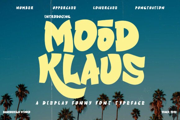
Mood Klaus is a bold display font with a distinctly playful personality. Its shapes are chunky, its curves are buoyant, and the overall impression is one of cheerful nostalgia — think mid-century cartoon signage or a vintage ice cream parlor sign, but with a clean digital edge. The letters are not trying to be subtle. They are wide, confident, and full of character. Every glyph feels like it was drawn with a marker on a sunny afternoon.
From a web designer’s perspective, this kind of typography is not something you use everywhere. It is a display font in the truest sense. It demands attention. When I tested it in a desktop hero section, the headline “Summer Shop” became the focal point of the entire page. The font’s natural rhythm made the words feel like they were almost bouncing in place. On a lighter background, the thick strokes held their weight without feeling heavy. On a darker background, the letters popped with a friendly, almost tactile presence.
What surprised me most was how well Mood Klaus translated to smaller screens. I resized the browser to mobile width and the headline remained legible, even at medium sizes. The generous x-height and open counters meant that the letters did not collapse into blobs. This is a common issue with highly decorative fonts, but Mood Klaus kept its shape. The retro cartoon vibe did not get lost in the compression. It stayed readable and charming.
Testing Mood Klaus on Real Web Layouts
I put Mood Klaus through several common web design scenarios to see how it performed beyond the hero section. Here is what I found:
- Landing page headlines: This is where Mood Klaus shines brightest. Whether it is a product launch, a seasonal sale, or a brand tagline, the font adds instant personality. The chunky letters work well for short, punchy statements. Three to five words feel ideal. Anything longer than a short phrase starts to lose impact, but for a headline, it is excellent.
- Call-to-action buttons: I tested Mood Klaus on a single CTA button — “Shop Now” — and it worked surprisingly well. The bold weight made the button feel clickable. However, I would recommend keeping the text short and giving the button plenty of padding. The font’s playful nature can make it feel less urgent, so it is best for soft CTAs like “Explore” or “Join the Fun.”
- Section headings: For interior page headings, Mood Klaus performed well when used sparingly. A “Meet the Maker” or “Our Story” heading felt warm and inviting. But I would not use it for every heading on a page. It is a display font meant for emphasis, not hierarchy.
- Logo text: I placed Mood Klaus in a mock logo for a creative studio. The font’s retro charm gave the brand an instant identity. It would work beautifully for a children’s brand, a summer pop-up shop, a creative agency, or a lifestyle blog. The only caution is that the font’s personality is so strong that it can overshadow other design elements. Keep the rest of the layout clean.
- Image overlays: I tested Mood Klaus over a busy background image. The thick strokes held up well, but readability depended on contrast. A subtle dark overlay or a semi-transparent background block helped the text stay clear. Without that, the letters could get lost in detailed photos.
Readability and Responsive Behavior in Practice
Readability is often the first concern with a decorative display font. In my tests, Mood Klaus performed better than I expected. On desktop, at sizes above 48px, the letters were crisp and easy to read. The bouncy curves did not interfere with legibility because the core shapes remain consistent. Each letter is clearly distinct — there is no confusion between “n” and “h” or “a” and “o.”
On tablet and mobile, I dropped the font size to around 30px for headings and 24px for short accents. At these sizes, the font remained readable, though the playful details became slightly less pronounced. That is fine. For mobile, the priority is scanability, and Mood Klaus delivered. The font’s bold weight helps it stand out even on small screens, which is a big advantage for mobile-first designs.
However, I would not recommend Mood Klaus for body copy, navigation menus, form labels, or any text smaller than 20px. The decorative nature of the font makes it difficult to read in dense paragraphs or small interface elements. If you are designing a website that needs long-form content, pair Mood Klaus with a clean sans serif font for body text. The contrast between a playful headline and a simple, readable body font creates a clear visual hierarchy that guides the user naturally.
Font Pairing Strategies for Web Projects
Pairing Mood Klaus with the right supporting typeface is essential for a balanced web design. I tested several combinations and found a few reliable options:
- Mood Klaus + a clean sans serif: This is my go-to pairing. A simple sans serif like a basic geometric or humanist font keeps the page grounded while Mood Klaus takes the spotlight. Use the sans serif for body text, navigation, and secondary headings. The contrast is clear and effective.
- Mood Klaus + a simple serif: For a more editorial or boutique feel, pairing Mood Klaus with a light serif font adds a touch of sophistication. The serif brings a classic warmth that complements the retro cartoon vibe without competing with it.
- Mood Klaus + a script font: This is a bold pairing that can work for creative brands or event pages. The script adds a handcrafted feel, while Mood Klaus provides structure. Use this combination sparingly, as both fonts are highly expressive.
- Mood Klaus alone: For very short pages or single-section landing pages, Mood Klaus can carry the entire typographic identity. Just make sure the rest of the design is minimal enough to let the font breathe.
What Mood Klaus Is Not Ideal For in Web Design
As much as I enjoyed working with Mood Klaus, it is important to know where it does not belong. The font is a display font through and through, and it should not be forced into roles that require subtlety or high-density information. Here are a few web design contexts where I would avoid using Mood Klaus:
- Body copy or long paragraphs: The chunky shapes and bouncy curves make extended reading tiring. Users will struggle to scan through more than a sentence or two.
- Small navigation links: At the typical 14–16px size used for menu items, the font loses its charm and becomes hard to read. Stick to a simpler font for navigation.
- Form fields and labels: Accessibility is a concern here. The decorative nature of Mood Klaus can make it difficult for users with visual impairments to interact with forms.
- Dense dashboard layouts: If you are designing a SaaS interface or a data-heavy admin panel, Mood Klaus is not the right choice. It is a font for expression, not for utility.
- Very small buttons or icons: At small sizes, the details of the font can get lost. Keep Mood Klaus for elements that are meant to be noticed.
Practical Considerations Before Using Mood Klaus on a Website
Before you add Mood Klaus to your next web project, there are a few practical checks to make. First, look at the included file formats. If you are using the font for a website, you will need webfont formats such as WOFF and WOFF2. Make sure the version you purchase includes these. If you are using Mood Klaus for client projects, check the commercial font licensing to confirm that web usage is covered. Some fonts require an extended license for embedding on live websites.
Also, check whether the font includes alternates, ligatures, or multiple weights. Mood Klaus, as a display font, may come with stylistic alternates that can give you more flexibility in headlines. If the font supports multilingual characters, that is a bonus for projects with diverse audiences. Finally, test the font in your actual design environment — whether that is Figma, Webflow, WordPress, or a custom codebase — before committing to it. The way a font renders on screen can vary by platform.
For web designers, Mood Klaus is a valuable addition to the toolkit. It brings a warmth and playfulness that is often missing from more serious typography. It is not a font for every project, but for the right project — a creative brand, a summer campaign, a children’s product, or a boutique online store — it can be the element that makes the design memorable. The key is to use it purposefully, pair it with restraint, and let its personality lead the way.